The Four Seasons Closes and I Go Crazy
Sometimes you have to get crazy. When you hear about a storied New York institution closing. When you read the articles, see the historical photos. When you see the auction website that will sell off all the assets of that place. When you know that you’ve never been there and that you only have a few weeks to change that. That’s when you have to get crazy. So I got crazy.
Back in the 1980s when I lived in New York City, I couldn’t afford a table at The Four Seasons on my two knish a day and Blarney Stone steam table happy hour budget. I read about The Four Seasons Restaurant closing awhile back, about a year ago. I put dining in the Pool Room on my list of things to do in the coming year thinking I had plenty of time to get to it. Time flies by. I see another article on my twitter feed — the restaurant will be closing in weeks! There was no time to vacillate. Will the flights be expensive? Of course! Will the hotel room cost way too much? Without a doubt! Will the restaurant bill itself be more than I earn all month? Naturally! But I couldn’t think about that. I had to fixate on this once-in-a-lifetime junket before the doors closed forever.
Junket Objective
Have dinner at The Four Seasons Restaurant in New York City, designed by Philip Johnson.
Transportation: The flight for 2 from Palm Springs to Newark was a splurge at $1489.52 including United’s Economy Plus seating. Crazy, right?
Cost of Lodging:  $687.53 + $25 resort fee per day for 3 nights at the Hudson New York in Midtown. That’s about $254 per night. (It’s Manhattan after all.) The good thing about the resort fee is that is gave you a $10 food and beverage credit per day. But if you didn’t use it each day, you’d lose it.
If you are a mid-century fan, I truly hope you dined at The Four Seasons at some point in your life. First, it’s in the Seagram Building, a modernist masterpiece. The restaurant was conceived as a Gesamtkunstwerk — a complete work of art. Every item on site was considered, right down to the matches — their colored tips changed with the seasons. Everything is harmonious, each piece builds upon the other for a completely cohesive experience. One doesn’t realize how many “off the shelf” articles are found in restaurants until you visit one where everything was designed for that place and that place alone.
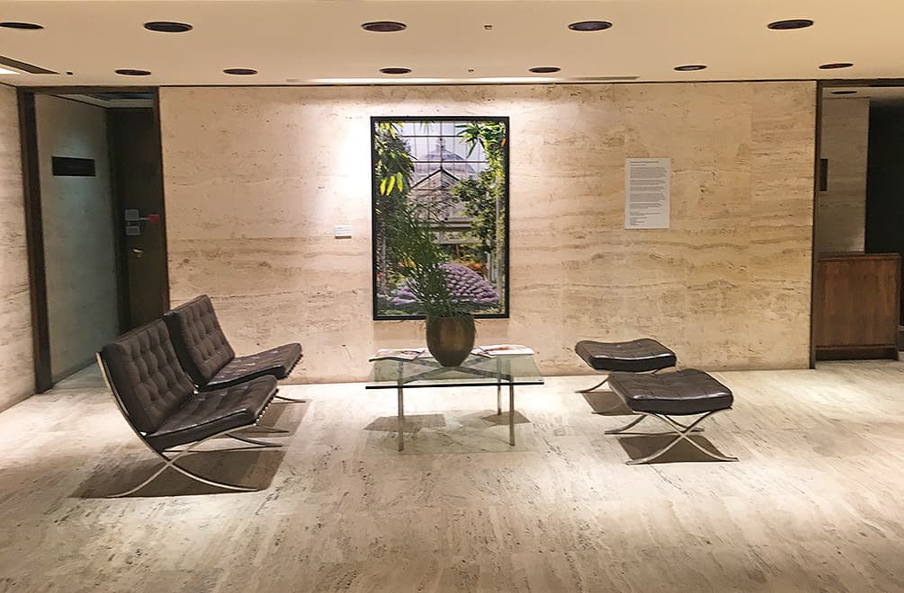
But let’s start with getting into The Four Seasons. The entrance is actually through a side door, but the mundane ends there. You are warmly greeted and ushered into the entry, which could be one of those dictionary illustrations of mid-century modern architecture. The Barcelona Chairs, situated inhumanly far from their ottomans. The gorgeous travertine walls and floors, mimicking a photographer’s seamless backdrop. The recessed lighting, designed to avoid glare on the diners walking underneath.
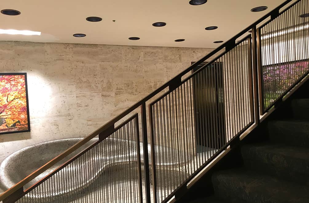
Philip Johnson wanted a grand staircase to mask that side door entrance aspect. That is a lounge made of nickels by Johnny Swing.
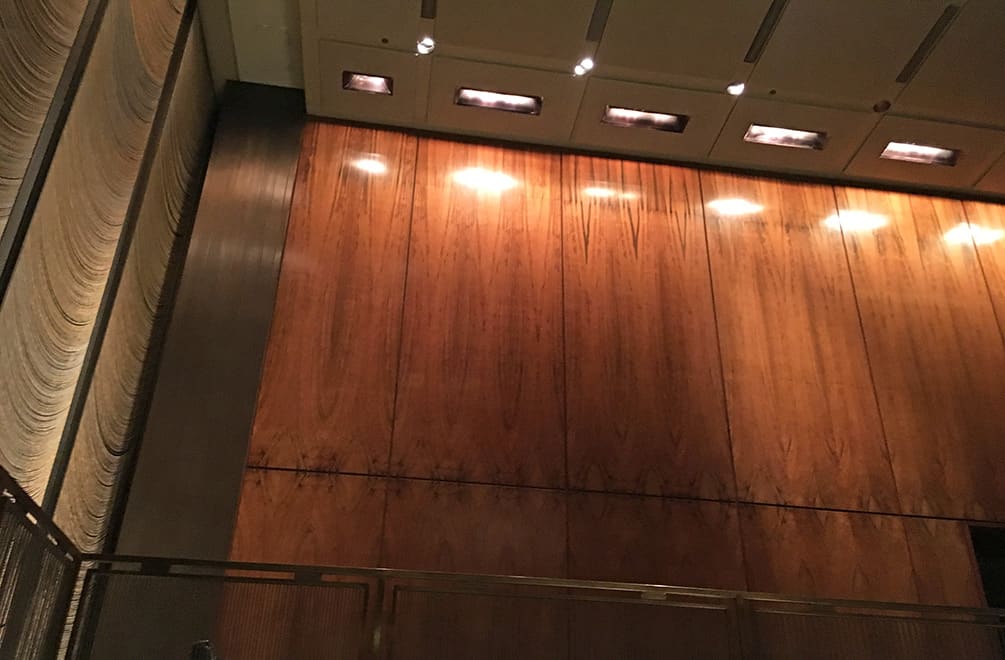
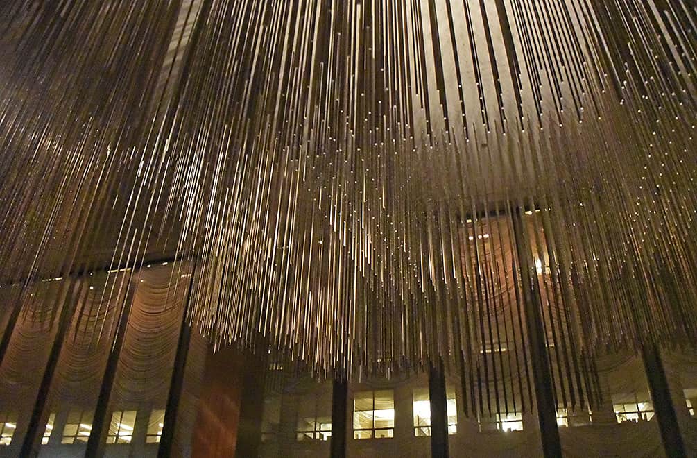
On the way up, you’ll see the monumental wood panels and the fluttering metal chain curtains.
At the top of the stairs, you have the bar and Grill Room on one side and the Pool Room on the other side. Dinner was in the Pool Room, so that’s where we headed.
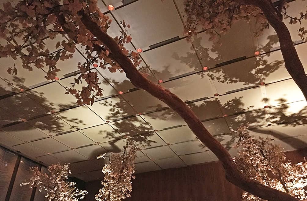
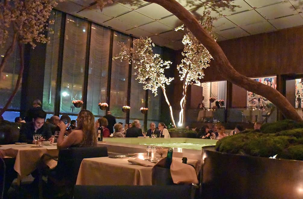
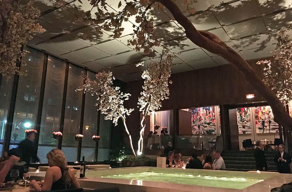
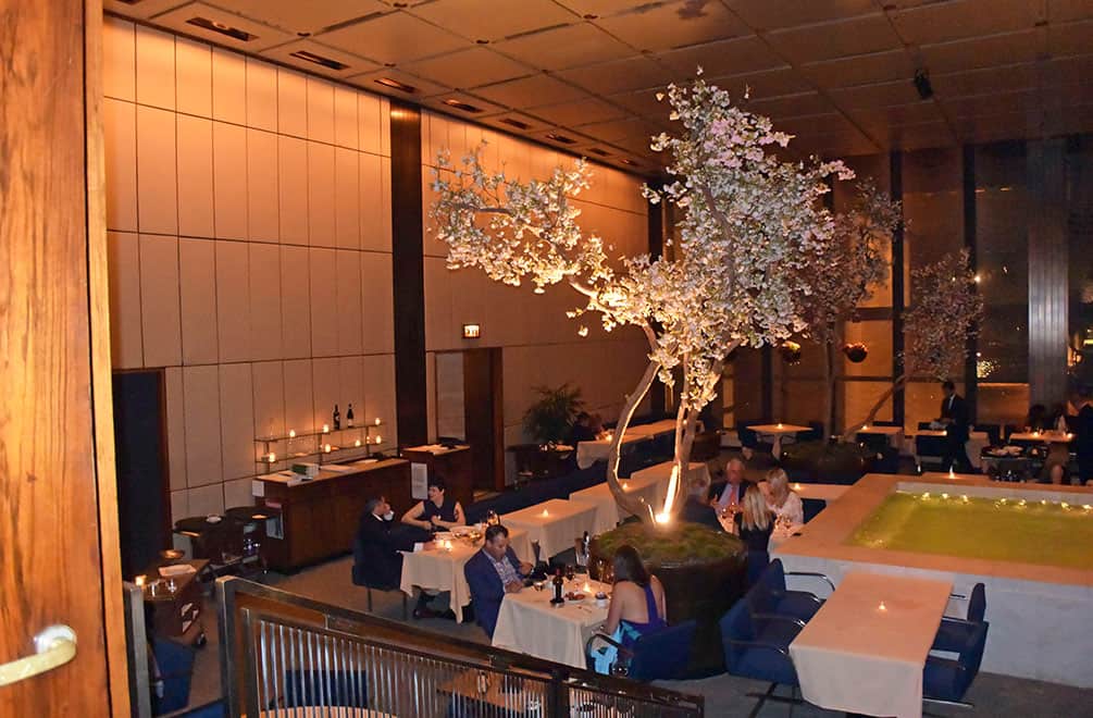
The Pool Room, with bubbling pool at center, is surrounded by trees which change with the season. I’m no arborist, but they looked like cherry blossoms to me. We were seated pool side, but equally impressive were the banquettes along the walls where you could discretely review and judge your fellow diners.
The shadows cast on the high ceiling in the square room created an inky, atmospheric floral skyscape. And although the restaurant was full, there was a soft murmuring soundtrack to the room. People were speaking normally, but the acoustics must have been designed to allow conversation at your table, but no eavesdropping on others.
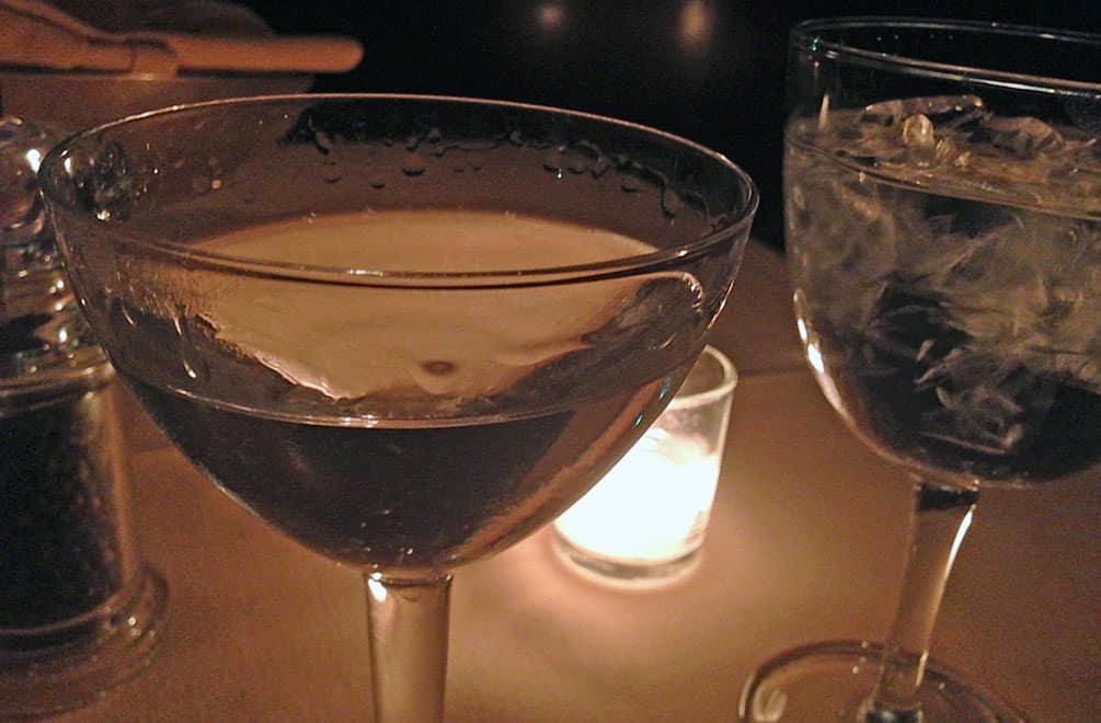
So then, cocktails. A strong, classic martini in a chalice-shaped glass. The photos don’t do this stemware justice, designed by Garth and Ada Louise Huxtable. It was the most lovely I’d ever seen. Clean, simple, perfect lines. I wanted to stick it in my purse. I didn’t and really wish I had. No wonder they are in the Museum of Modern Art.
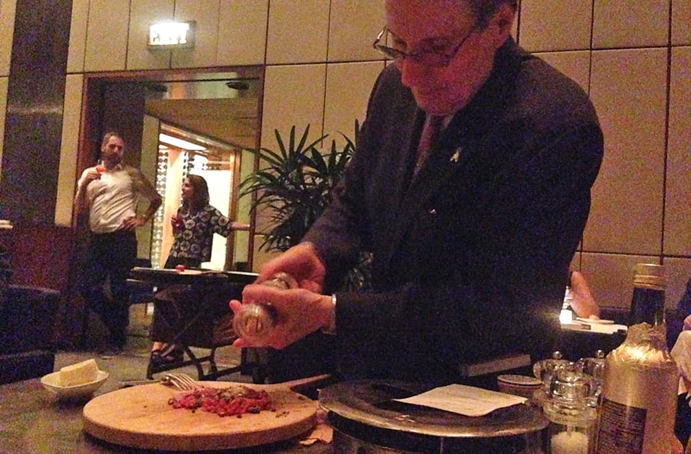
Appetizers were next. Steak tartare prepared tableside. I asked the waiter if I could take his photo. He said, ” Why not? It’s a free country.” He wasn’t being sarcastic. He had presented this dish thousands of times and taking a picture of him while doing so wouldn’t ruffle him in the least. He was quick, official and but never rushed. In his tailored suit, his attitude coordinated with the surroundings, as if he had been fashioned specifically for the restaurant, like everything else in the Four Seasons. He even stopped by to say goodbye later as we were sitting at the bar. The tartare and the whole meal was excellent, as was the service the rest of the evening. (I don’t take many food shots as I’m usually too busy eating, hence no meal photos.)
The Brno chairs designed by Mies van der Rohe, here shown in the upper dining section of the Pool Room, were a pleasure to sit on. So much mid-century furniture looks streamlined and beautiful, but sitting on it is torture. My 6-foot husband was very comfortable as was I — and I’m rather short. This seating was well-designed for long dinners and formal attire.
As the restaurant emptied, we could go into the upper room for a photo or two. Time for a nightcap.
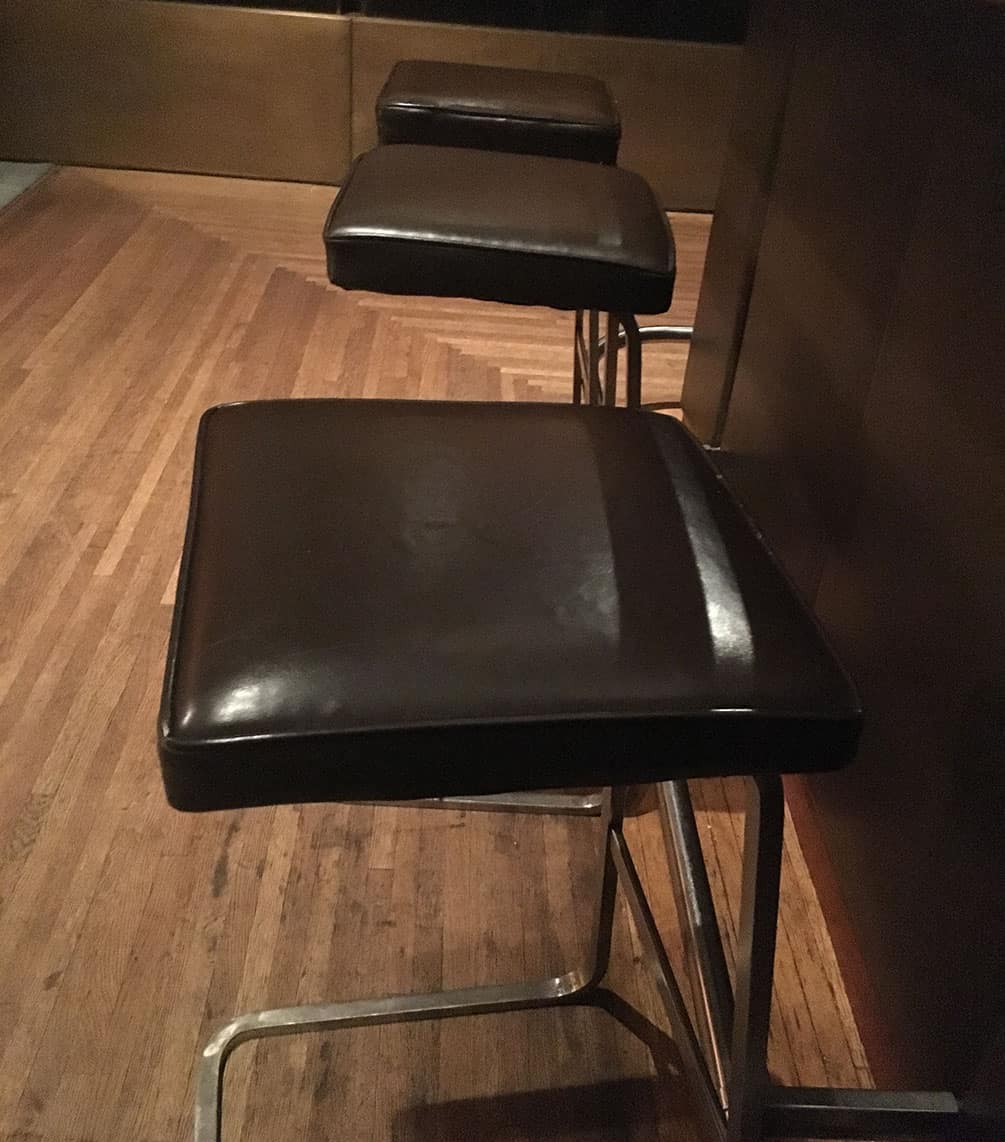
Heading into the bar, I spied the bar stools, designed by van der Rohe and Johnson, which looked like they would be true back-strainers. A short person often has bar stool issues, but shed no tears for me because these stools were a dream. I guess that’s why Knoll still manufacturers them.
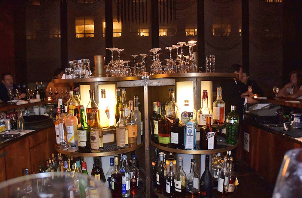
The square bar with the sensational lazy Susan or the Lippold sculpture overhead weren’t even the best part of the nightcap experience.
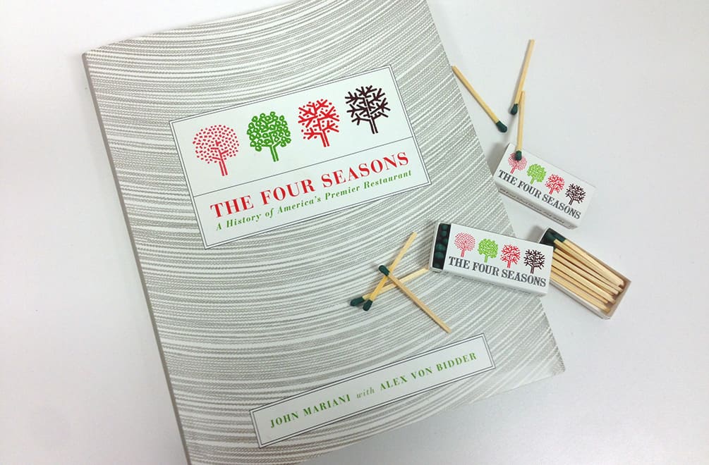
Our bartender, Christopher, took a liking to my husband and IÂ as we had traveled across the country to visit The Four Seasons. He immediately gave us a book about the restaurant and asked us if we wanted to see the “Stella Rooms,” the private dining rooms named after Frank Stella as his art used to be displayed there.
The private rooms, sided with harewood, (the same wood used to make Stradivarius violins), were warm and rich, the punctured ceiling created a starlight effect. These features enabled these rooms to be used for both fairytale wedding receptions or corporate dealmaking. That’s no mean feat. Unfortunately, I think the expense or the wood scarcity would make this type of room impossible to construct today.
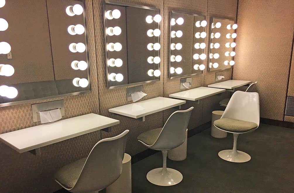
No visit to The Four Seasons is complete without visiting the Ladies Room Lounge. The Saarinen Tulip chairs invite you to sit down and fix your face in front of a bare-bulbed, dressing room mirror. Take a tissue from the built-in box and blot that lipstick. And that color palette!
On July 16, The Four Seasons served its last diners. An auction of furniture, plates, glasses, cookware, signs and serving carts will be held July 26. A new Four Seasons will relocate a five minute walk away in about a year. But how can it be the same? Without the perfectly proportioned windowed room which has been called a “cathedral” (it is, in my opinion), without the graphic design of Emil Antonucci, without the imprint of Philip Johnson and Mies van der Rohe, it cannot really call itself The Four Seasons. The Seagram Building location is a protected landmark, so some of the integrity of the Johnson design will remain untouched: the marble pool, the French walnut paneling, the bar and the Lippold sculpture hanging above it. Aby Rosen, who will open a new restaurant in the space and has been petitioning to make changes to the space, says he wants the successor restaurant to be ” a really cool place.” DUDE! It already was.
I’m ecstatic I got to have an such an unforgettable evening at The Four Seasons before it closed. Yes, it was a splurge and yes it was crazy to fly across the country to have a meal. But crazy for something is better than regret about something. And if I hadn’t had that moment of impetuousness, I wouldn’t have experienced this perfectly designed environment on this magical night, encountering those magical New Yorkers. I am sad that it took me so long to get there and sad that this modernist diamond might get cut up into something coarse. But a little insanity earned me a memory that shimmers and ripples like the chain curtains on the windows.
That’s nice. Sooo, should I go? Well, you can’t now, but I hope you did.
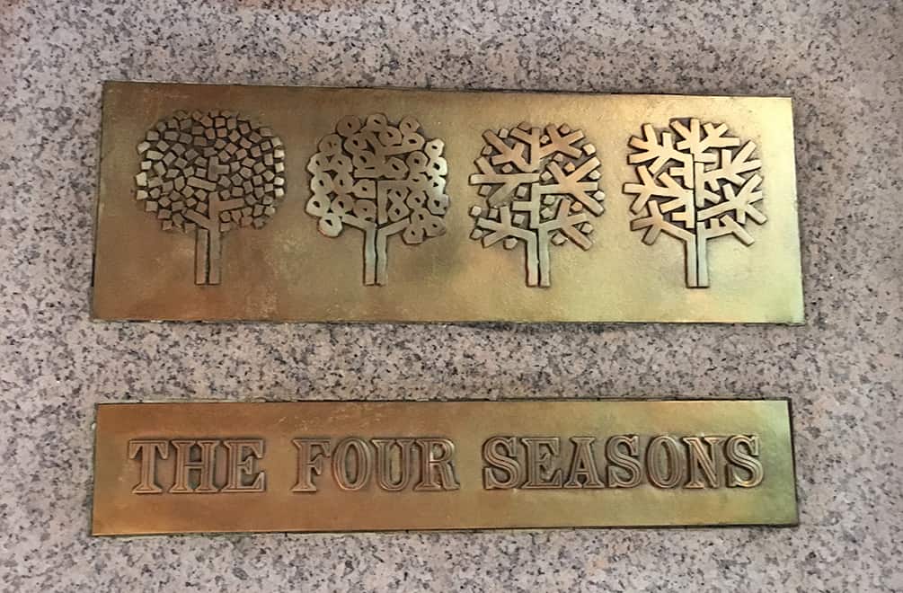
I’m smitten. Tell me more. Illustrator Emil Antonucci designed the logo for The Four Seasons. Although not particularly well-known, his work reflects a less hard-edged modernism.
Location 99 East 52 Street New York, New York 10022. Stay tuned for the new, relocated address.
Cost About $400 for 2, including tip. We had 2 cocktails each, 2 glasses of wine, 2 appetizers, 2 entrees, sides, coffee and dessert. And 2 nightcap cocktails.
Tip The book The Four Seasons, A History of America’s Premier Restaurant, is a fascinating read that touches on Johnson’s process, covers the celebrity diners and contains recipes like Tiny Shrimp in Potato Baskets with Sauce Shoyu.
Mark Kaufman
So glad to have made this junket with you. It was amazing.
designjunket
Approve.
Jacqueline McCarthy
Vivitiv
WE HAVE MOVED
PLEASE NOTE NEW ADDRESS
333 N PALM CANYON DR.
SUITE 210
PALM SPRINGS, CA 92262
760-203-2941
Visit my blog: https://www.designjunket.com