Real Life in the Liljestrand House Kitchen

If you’re following along, we’re continuing a tour through the mid-century modern marvel, the Liljestrand House. Bob Liljestrand, who grew up in this home, is our tour guide. We’re been upstairs, viewing the living room, bedrooms, and the super cool concealed stereo. We now move into the kitchen and dining area.
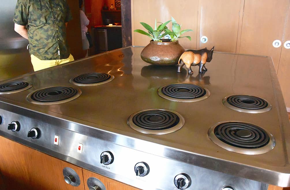
Betty Liljestrand did a good deal of entertaining, as any doctor’s wife would do around the middle of the last century. Her kitchen reflects this — spacious, practical and designed with features she conceived and requested of Vladimir Ossipoff, the architect. The kitchen, like the rest of the home, is in impeccable shape. (Obviously the family cares deeply about the home and maintaining it.) The range was pristine, as was the stainless seating area/work area around it. Bar stools (not shown) are nestled under the far end.
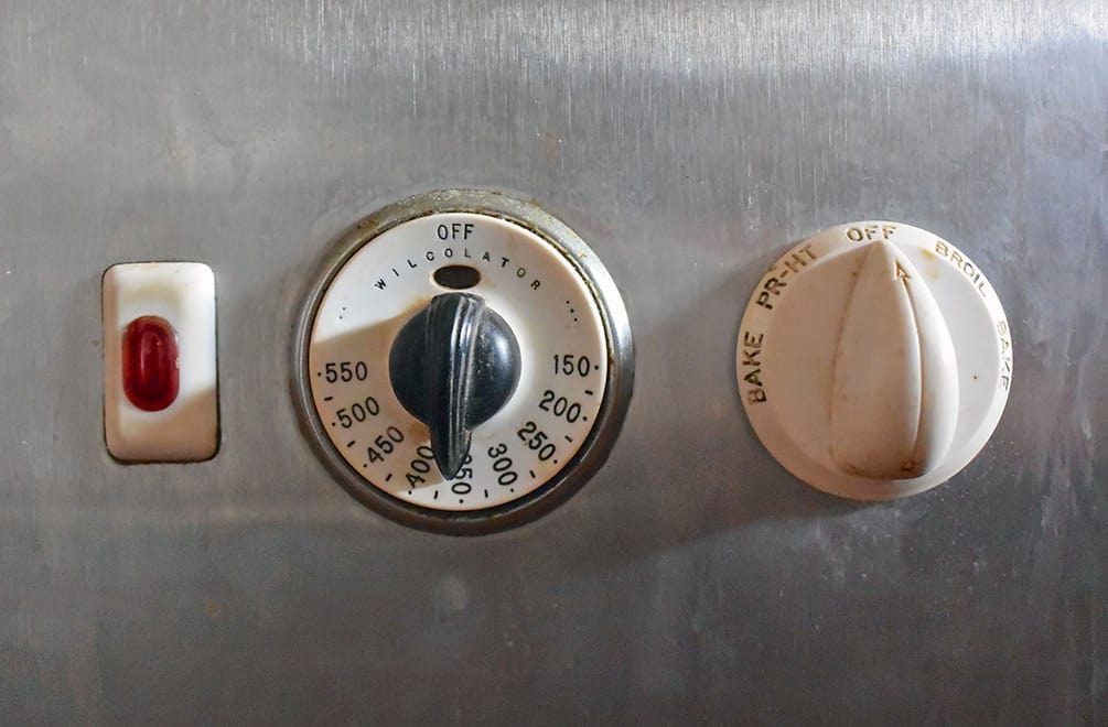
The original Thermador oven still works and looks beautiful.
More unique built-ins are in the kitchen. A hamper. Next to it was a ironing board hidden in a cabinet.
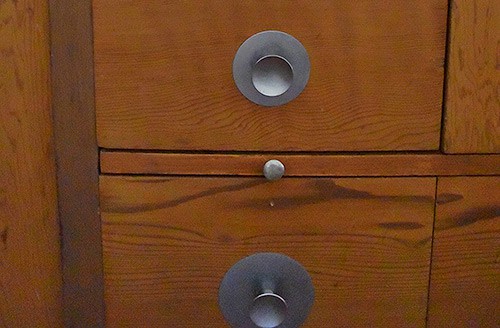
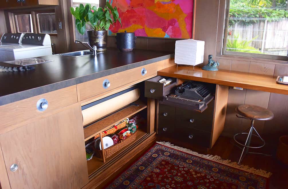
At first glance, I thought the board with the small pull in the photo below was a cutting board. But they were all around the kitchen and at all heights. Betty had steps built in among the kitchen drawers and that is what these “boards” are. She could pull this out and get to the higher shelves. Genius!
Opposite the range island is a wrapping station — yes, wrapping station. Real life at the Liljestrand House must have included lots of gift giving! Note the pull-out typewriter and rolodex. Bob said his mother was a prolific letter writer and much of the history of the house is in her notes. (The projection room downstairs holds the house documents.)  A modern aside: that is a contemporary washer/dryer in the back. Time marches on, as does dirt.
Gorgeous shelf, one of the few things thought not to be designed by Ossipoff. And I don’t know about you, but doing dishes would be a lot more enjoyable with this view from the kitchen.
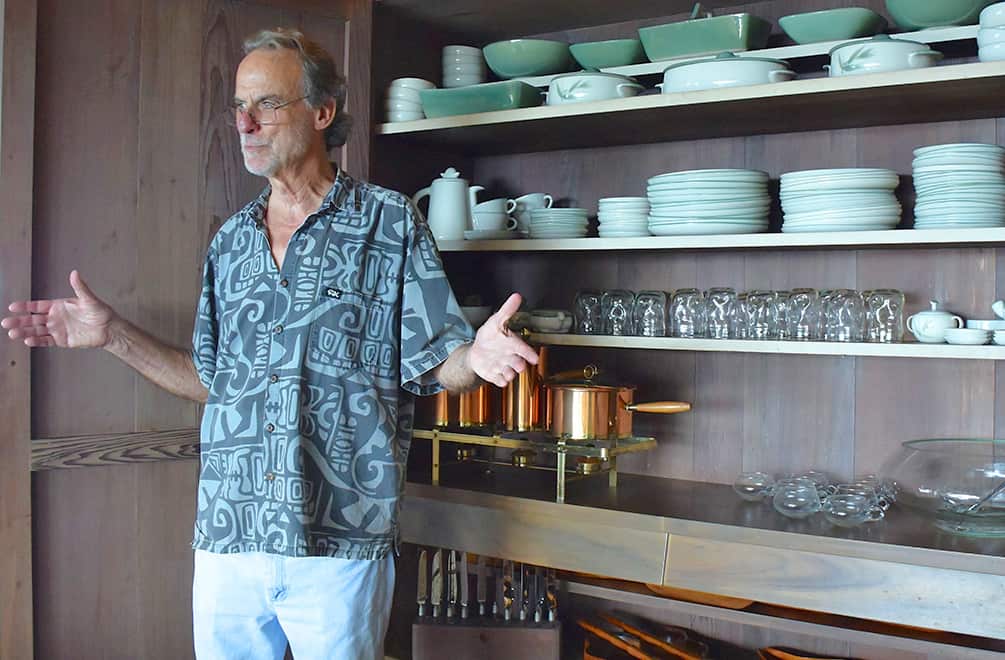
Well, I hate to leave the kitchen, but heading into the dining room are more built ins. Bob showed us this large cabinet, opposite the dining table. It holds the lovely celadon dishware, glasses, a punch set, cutlery, wood serving dishes and a copper chafing set and is of the redwood that I am in love with.
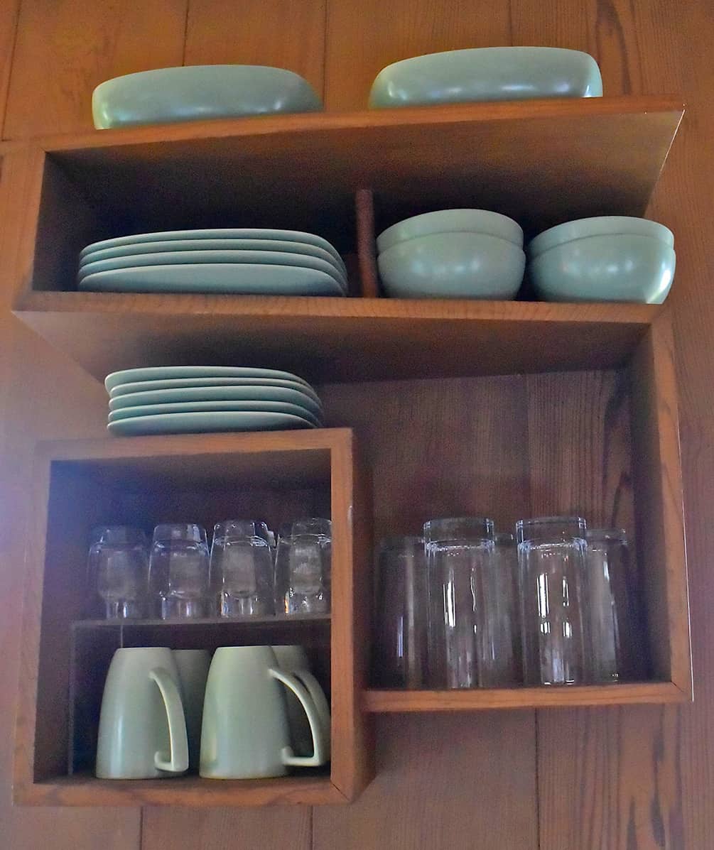
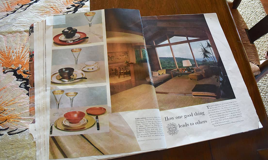
There was yet another built in cabinet holding dinnerware. This one held the set featured in perhaps one of the first “advertorials” of the time. House Beautiful was advertising the table settings featured in the ad below as part of the Liljestrand House Pacesetter  issue. They figured it would be more authentic if they actually brought the sets in and placed them in the home, which they did. You can get a glimpse of the dining room from the ad.
House Beautiful was one of the first of many publications to feature the Liljestrand House, but it wouldn’t — and won’t — be the last. The Hawaiian House Now, Honolulu Magazine, and Buzzfeed (among others) included it in their pages. Continuing on through the house, one can see why.
Next stop: the Rec Room! (Love to say that.)


1 Comment